Dutch Bros
A brand refresh that became a drive-thru UX fix.
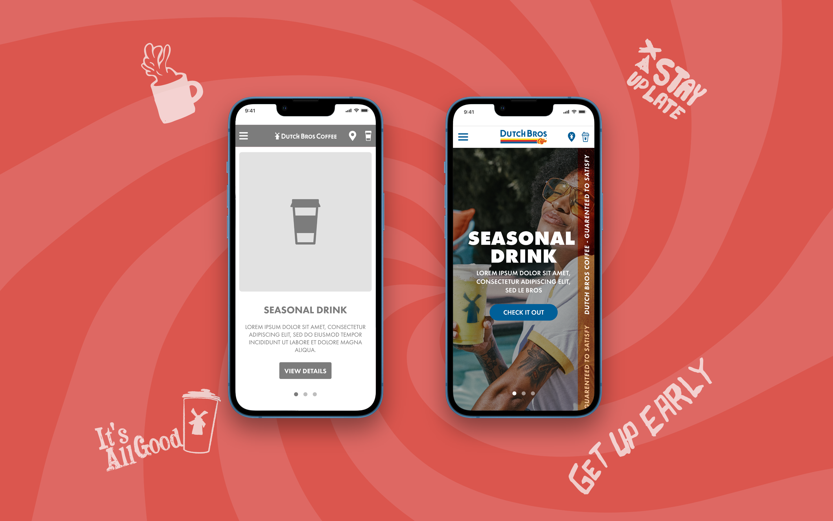
A marketing site visual redesign for Dutch Bros that grew into a reorganized mobile menu — designed after sitting in the drive-thru line myself and realizing customers had nowhere to browse the menu before reaching the ordering window.
ROLE
UX & UI Designer
CLIENT
Dutch Bros (via Hathway, subcontracted to Stellar)
TEAM
Stellar Agency
BACKGROUND
A visual job, on paper.
Dutch Bros hired Hathway to refresh their marketing site, and Hathway brought in Stellar to execute the design work. On paper the brief was straightforward: Dutch Bros would supply brand assets, and we'd handle the UX and visual design needed to bring the site up to date. The original scope was explicitly modest — enough UX to demonstrate the underlying structure had been considered, alongside a few visual directions for the client to choose from.
That scope didn't stay modest for long.
THE CHALLENGE
The problem wasn't on my screen. It was in my car.
The insight that reshaped this project didn't come from a stakeholder interview or a heuristic review. It came from sitting in the Dutch Bros drive-thru line in my own car.
There was no menu to look at until you reached the ordering window. Dutch Bros' menu is large and genuinely overwhelming for a first-timer — dozens of drink variations, sizes, and customizations — and with a line of cars behind me, I felt real pressure to decide fast with no way to prepare. The mobile site existed, but its menu wasn't organized so someone waiting in line could actually browse and decide before they got to the window.
That's not a visual design problem. It's a UX problem sitting quietly underneath a visual redesign brief — and nobody had scoped it, because nobody else had gone through the drive-thru with the question in mind.
THE WORK
Reorganizing the menu around the moment it's actually used in.
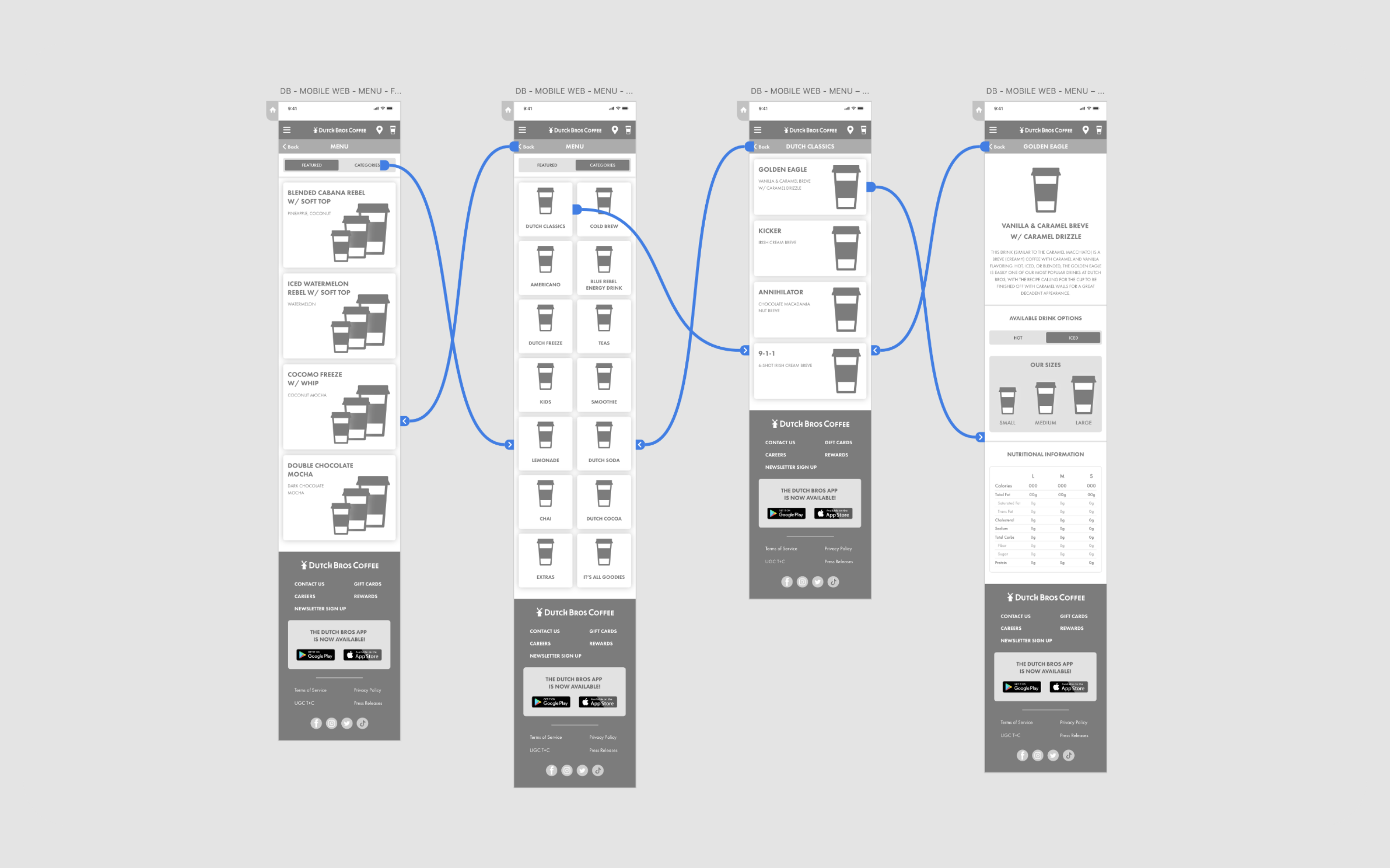
I turned the observation into a concrete UX proposal: reorganize the mobile menu into coherent, scannable categories designed specifically around the drive-thru moment — someone with a phone in hand, limited time, and a car behind them, trying to land on an order before reaching the window.
I built it out and presented it to Hathway and Dutch Bros unprompted. They hadn't asked for it, but they recognized the problem immediately once it was in front of them, and gave me room to keep developing it rather than treating it as scope creep to push back on.
The project's own paperwork shows how far the scope moved. The original estimate budgeted 52 hours of UX against 320 hours of visual design — UX was a fraction of the job. By the final scope, UX had grown to 160 annotated-wireframe hours across 10 to 14 templates, alongside a full front-end build and a dedicated QA pass. What started as "enough UX to say we thought about it" became a load-bearing part of the deliverable, because the actual UX work mattered more than the brief assumed.
OUTCOME
Still in the drive-thru line today.
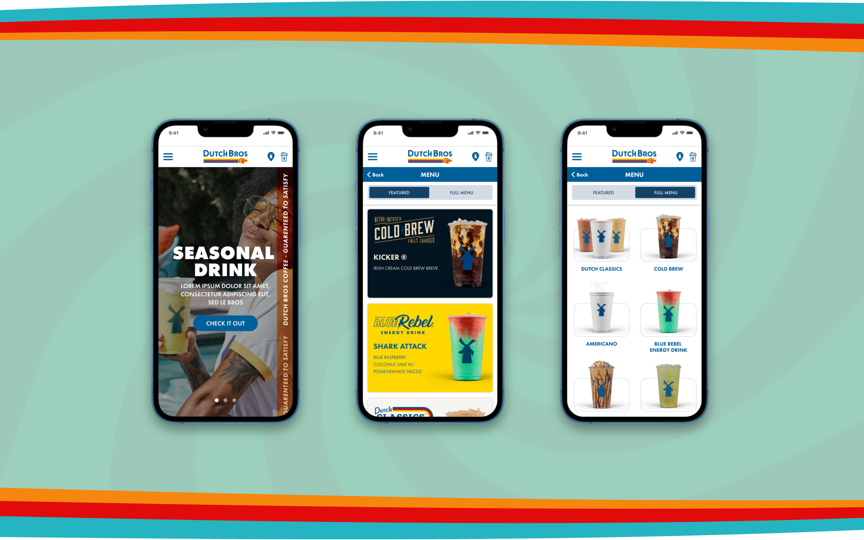
The reorganized mobile menu shipped, launched on dutchbros.com, and is still in use today — years after the engagement wrapped. A visual refresh brief ended up producing a permanent change to how Dutch Bros customers order from their phones while waiting in line, which is exactly the moment the fix was designed for.
REFLECTION
I can't turn off the UX instinct, and I've stopped apologizing for it.
This is the clearest example I have of something that's just true about how I work: I can't look at a visual design problem without also seeing the UX problem sitting underneath it. I wasn't hired to rethink the drive-thru experience. But once I'd sat in that line and felt the pressure of an overwhelming menu and a queue of cars behind me, I couldn't unsee it — and I didn't have it in me to ship a prettier version of a site that still didn't solve that moment.
The best UX insights don't always come from research sessions or client briefs. Sometimes they come from using the product yourself, in the real physical situation a customer is actually in, and noticing what nobody thought to ask about. Dutch Bros didn't ask for this. They just recognized it when they saw it — and the fact that it's still live years later is the proof it was worth the scope creep.