HPE
Redesigning the customer experience for HPE's enterprise software portal.
A visual and UX overhaul of a live, globally deployed platform. Inherited architecture, redesigned the experience.
ROLE
UX & UI Designer
CLIENT
HPE
TEAM
Stellar Agency + Pihu Technology
BACKGROUND
Built on a strong foundation.
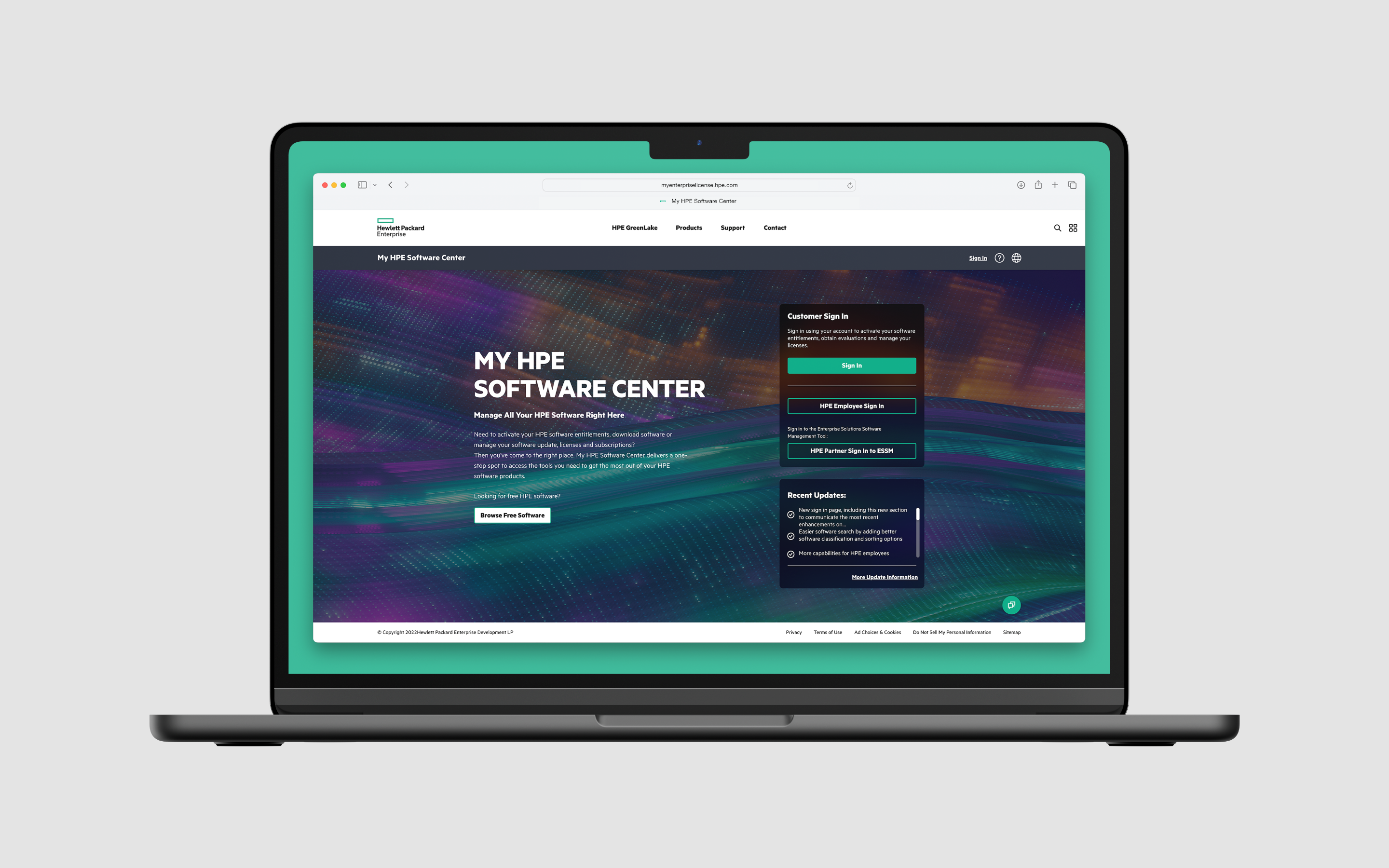
Stellar has been HPE's design partner since 2017. By the time I joined in January 2021, the team had spent years designing and building My HPE Software Center from scratch — a self-service portal where enterprise customers activate licenses, manage subscriptions, track contract expirations, and handle the full lifecycle of their software assets. It ran in 13 languages across 33 global markets, mission-critical infrastructure for tens of thousands of users.
It was also a genuine success. The platform the team had designed worked — solid architecture, proven workflows, customers depending on it daily. That success created its own momentum: users wanted more visibility into their assets, more proactive information, more ways to act quickly without navigating deep into the product. My job was to answer those expectations — to take a strong foundation and evolve it toward where HPE and its users were headed.
THE CHALLENGE
Redesigning without breaking anything.
Redesigning a live enterprise platform is a different problem than building one from scratch. There's no blank canvas. Every decision has to work within an existing system, respect established user behaviors, and ship without disrupting workflows tens of thousands of people depend on daily. The constraint isn't a limitation — it's the job.
The challenges were two-sided. Visually, HPE's brand had evolved significantly since the original portal launched, and MSC needed to catch up — not cosmetically, but at the level of typography, color, component design, and overall polish. On the UX side, the platform's original three-tab navigation had been designed for a simpler product. MSC had grown considerably, and the tab model wasn't scaling with it.
There was also something missing entirely. For a platform whose primary job was helping users manage software assets, MSC had no real home base — no place to land, immediately understand the state of your account, and take action without digging.
THE WORK
Two tracks, one release.
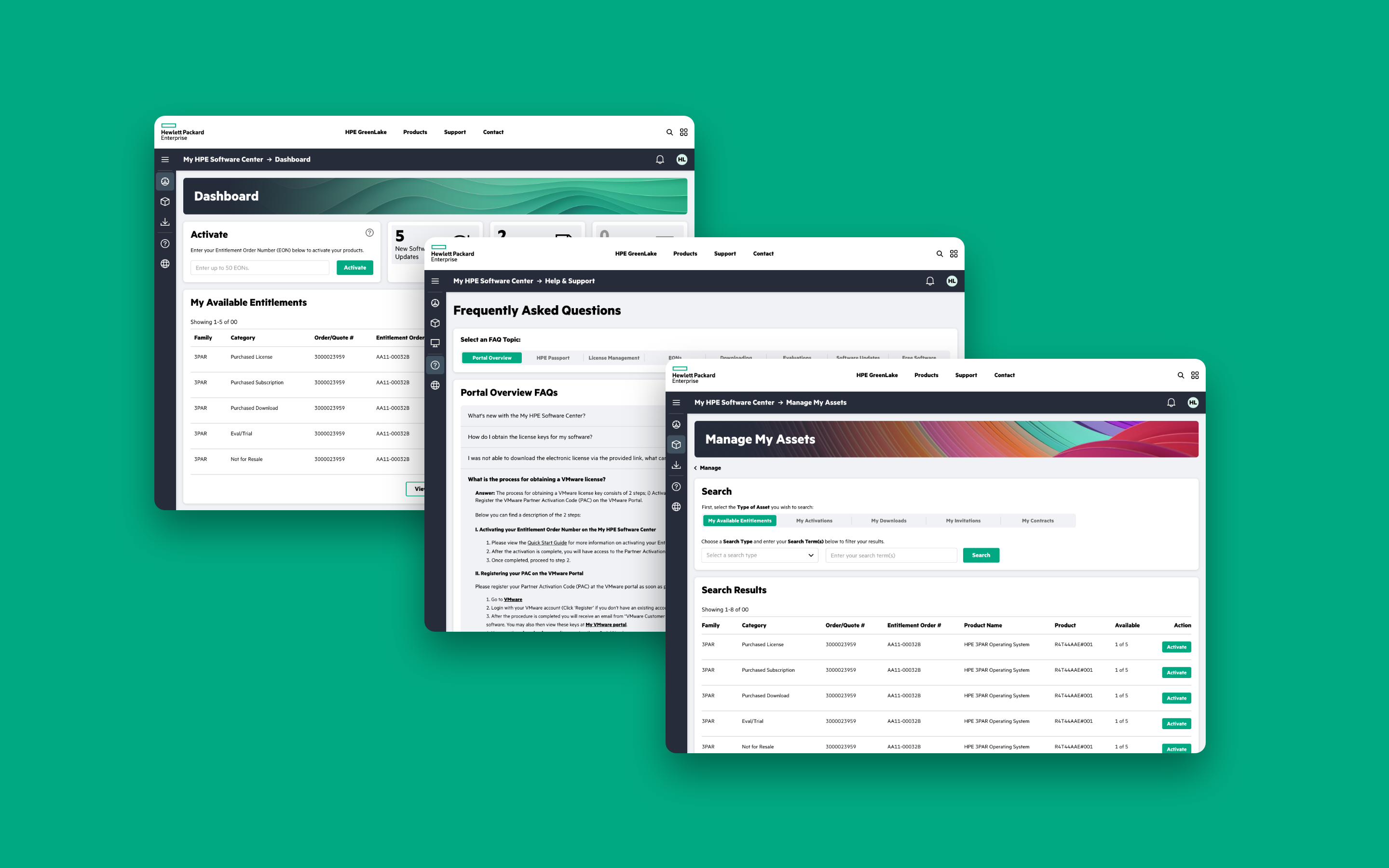
The redesign ran on two parallel tracks. The visual overhaul touched everything — typography, color, iconography, component design, overall polish — bringing MSC in line with HPE's evolving brand while establishing a design language that could scale across 13 language variants and 33 markets. Not a reskin: a systematic rebuild of the visual layer on top of a proven architecture.
The UX refresh had a clearer centerpiece: replacing the three-tab navigation with a persistent side nav, and introducing a user dashboard that hadn't previously existed. The side nav solved a scaling problem — as MSC grew, the tab model had accumulated more than it could comfortably hold. A persistent side nav gave users a stable mental model: always visible, always oriented, always one click from wherever they needed to go.
The dashboard solved a different problem. Previously users landed with no sense of where things stood. Now they saw it at a glance: software updates waiting, contract expirations approaching, invitations pending. Status information that had required navigation to find was front and center on arrival.
The most deliberate decision was where to put the Activate card. Product activation — entering an Entitlement Order Number to unlock a license — is the single most common task MSC users perform. We gave it prime real estate: a persistent, always-visible card where users could enter up to 50 EONs in one action without going anywhere else. A task that had required navigation was now available the moment you logged in.
OUTCOME
One release. One foundation.
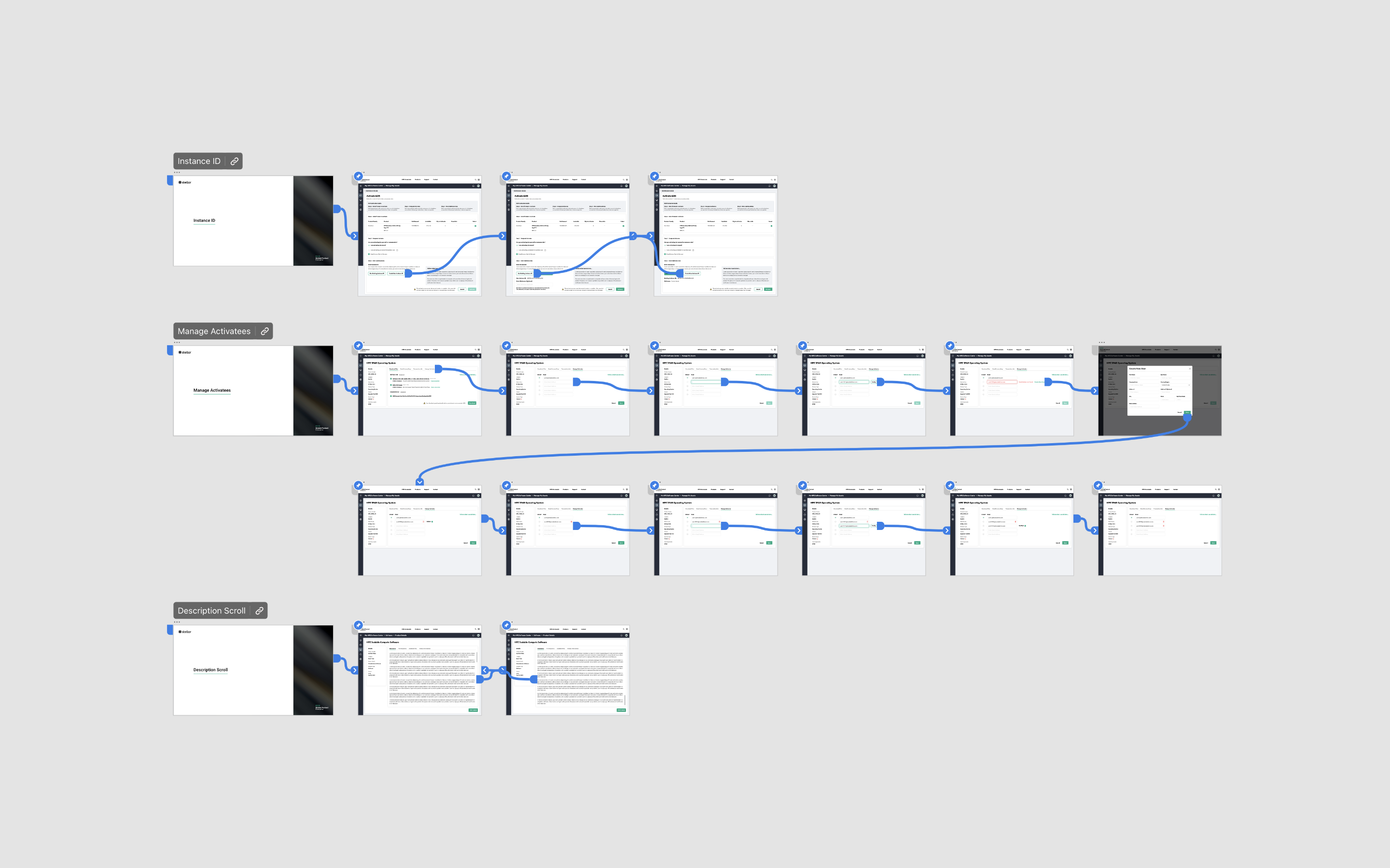
The work shipped as a single major release — a full visual and UX overhaul delivered to a global platform without disrupting the workflows its users depended on. For HPE it meant a product that finally matched where the brand was heading. For users it meant a different first experience: a dashboard that told them what mattered the moment they logged in, a navigation model that scaled with the product, and a direct path to the task they performed most.
It also set the foundation for what came next. The design language established here became the baseline for subsequent HPE portal work, including the MSC 2.0 rebuild and the Bumblebee project that followed. Getting the foundation right the first time made everything after it faster and more coherent.
REFLECTION
Designing inside someone else's architecture.
There's a particular discipline required when you're designing inside someone else's architecture. You're not there to reimagine the product from first principles — you're there to honor what's working, identify what isn't, and make it better without leaving fingerprints on the parts that don't need you.
Greenfield design gets more attention, but redesigning a live platform real people depend on is where you develop real judgment: what to change, what to leave alone, and how to introduce new patterns without confusing users who already know the product. The dashboard, the side nav, the Activate card — none were radical departures. They were careful evolutions of a system that already worked, made by someone who respected the work that came before it.
The design language we established here carried forward. MSC 2.0 built on it. Bumblebee took it in its own direction — a fraternal twin rather than an identical one. That kind of continuity doesn't happen by accident. It happens when the foundation is laid with enough intention that the next person can work with it, not against it.