HPE
Repainting a platform, then making it better than the paint required.
A full visual rebrand of HPE's MSC platform, applying HPE's new corporate identity across hundreds of screens — and going beyond the brief where HPE's own design system didn't hold up, starting with a custom-built data table.
ROLE
Lead UX/UI Designer
CLIENT
HPE (MSC)
TEAM
Stellar technical team; Director of Strategy (available, not leading)
BACKGROUND
When the whole company changes its clothes.
In 2024, HPE rolled out a corporate rebrand — new logo, new visual identity, applied across their product portfolio. MSC, the platform I'd been working on for years by this point, needed the same treatment: every screen, every component, restyled to match.
This project marked a shift in how I was working with the MSC team. On past HPE engagements, our Director of Strategy had been driving strategy alongside me. Here I ran point as Lead UX/UI Designer — he was available if I needed him, but this was mine to own. The development team stayed on as the technical partners making the visual system buildable.
THE CHALLENGE
A brand refresh isn't just a find-and-replace.
On paper a rebrand sounds mechanical: swap the colors, swap the logo, apply the new type system. In practice MSC is hundreds of screens deep, and HPE wanted to review essentially all of them against the new brand. That volume alone made it one of the largest-scope projects I'd run on the platform.
The harder problem was that HPE's own design system, Foundation, wasn't sufficient everywhere. Applying it faithfully in every case would have meant shipping components that were on-brand but functionally worse than what already existed. The data tables were the clearest example: Foundation's default table patterns didn't hold up to what MSC customers — thousands of them, working with dense entitlement and product data — actually needed.
THE WORK
Following the brand, except where it was wrong.
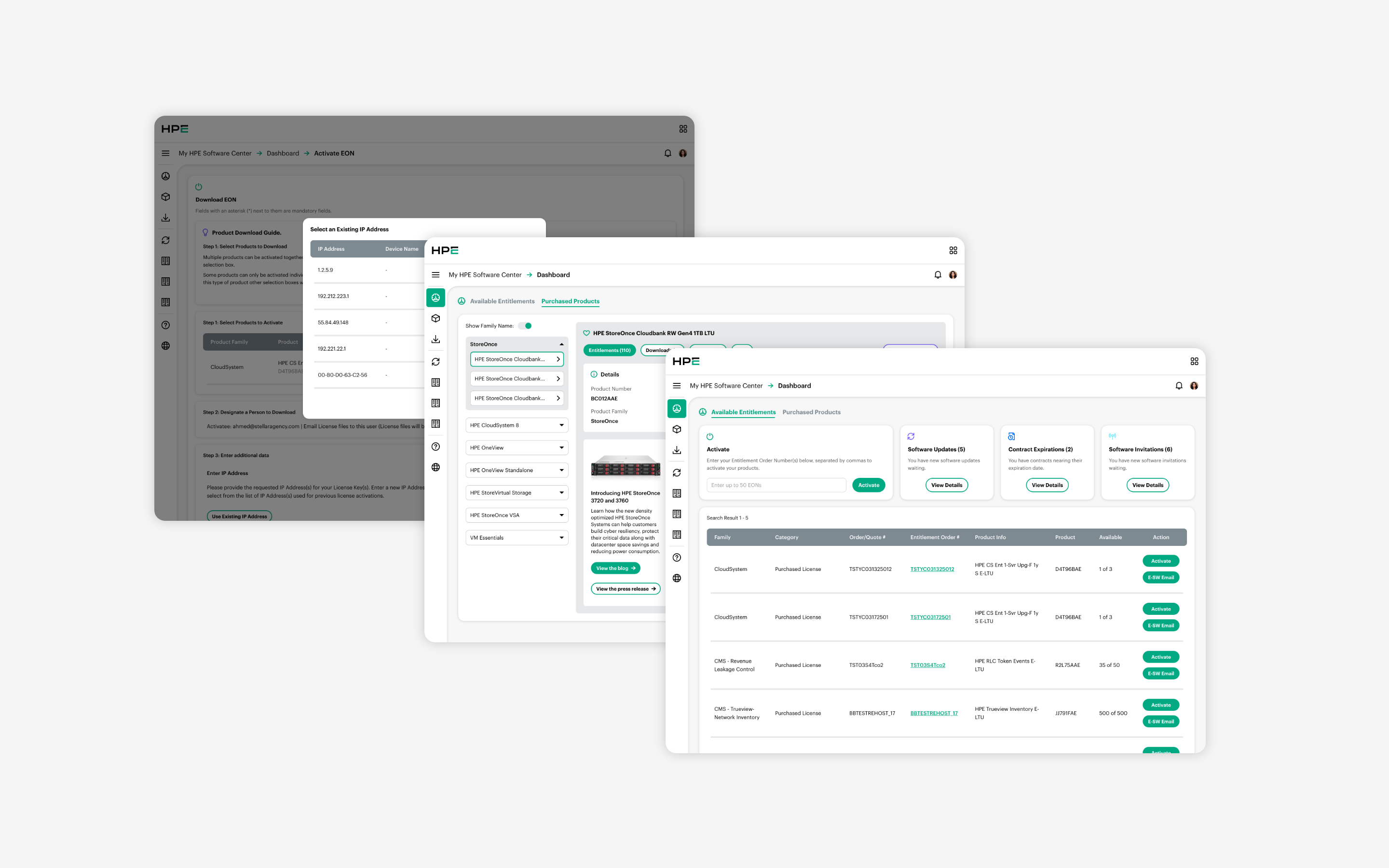
I led the rebrand application across MSC's full surface area, translating HPE's new visual identity into the platform's existing screens and components at scale. Most of the work was disciplined execution: taking the new brand system and applying it consistently and correctly across a genuinely enormous number of screens, then walking HPE's stakeholders — the same primary reviewer as on past projects — through each one for approval.
BEYOND THE BRIEF
Where Foundation fell short, and why that mattered.
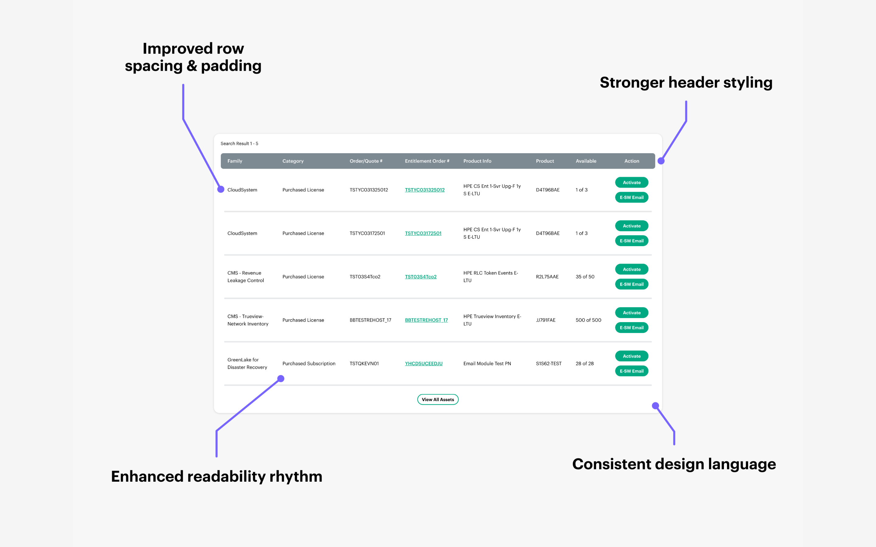
Foundation is built to work across HPE's whole product portfolio, which means its default components are necessarily generalized — good enough for most contexts, optimized for none. MSC's data tables are where that showed. Customers there work with dense entitlement, order, and product data, the kind that needs scanning and cross-referencing across many rows and columns at once. Foundation's table patterns weren't built with that density in mind.
Rather than applying the default component as-is and accepting the compromise, I designed a custom table that stayed inside the new brand's color, type, and spacing language while actually solving MSC's density problem — clearer row separation, better handling of expandable detail, and a hierarchy tuned to how customers actually scan the data. It's a small piece of the overall rebrand, but it best represents the judgment call underneath the whole project: follow the system where it works, and have the standing to build something better where it doesn't.
OUTCOME
Shipped, live, across the whole platform.
The rebrand fully shipped and is live on MSC today — hundreds of screens restyled, reviewed screen-by-screen with HPE, signed off, and in production.
REFLECTION
Owning the whole thing, not just my piece of it.
What stands out to me about this project, more than the visual work itself, is what it represents about how the relationship with HPE evolved. Early on, I was executing within someone else's structure and someone else's strategic lead. By this project, I was running the whole thing — accountable for hundreds of screens, the primary point of contact for stakeholder review, and trusted to make the call on where to deviate from HPE's own system when it wasn't good enough.
The data tables are a small detail in a huge project, but they're the detail I'd point to if I had to explain what "good design leadership" looks like inside a brand rollout: following the system faithfully everywhere it works, and having the judgment — and the standing — to build something better where it doesn't.