Port of Long Beach
Sixty-plus pictograms, one hand-drawn visual language.
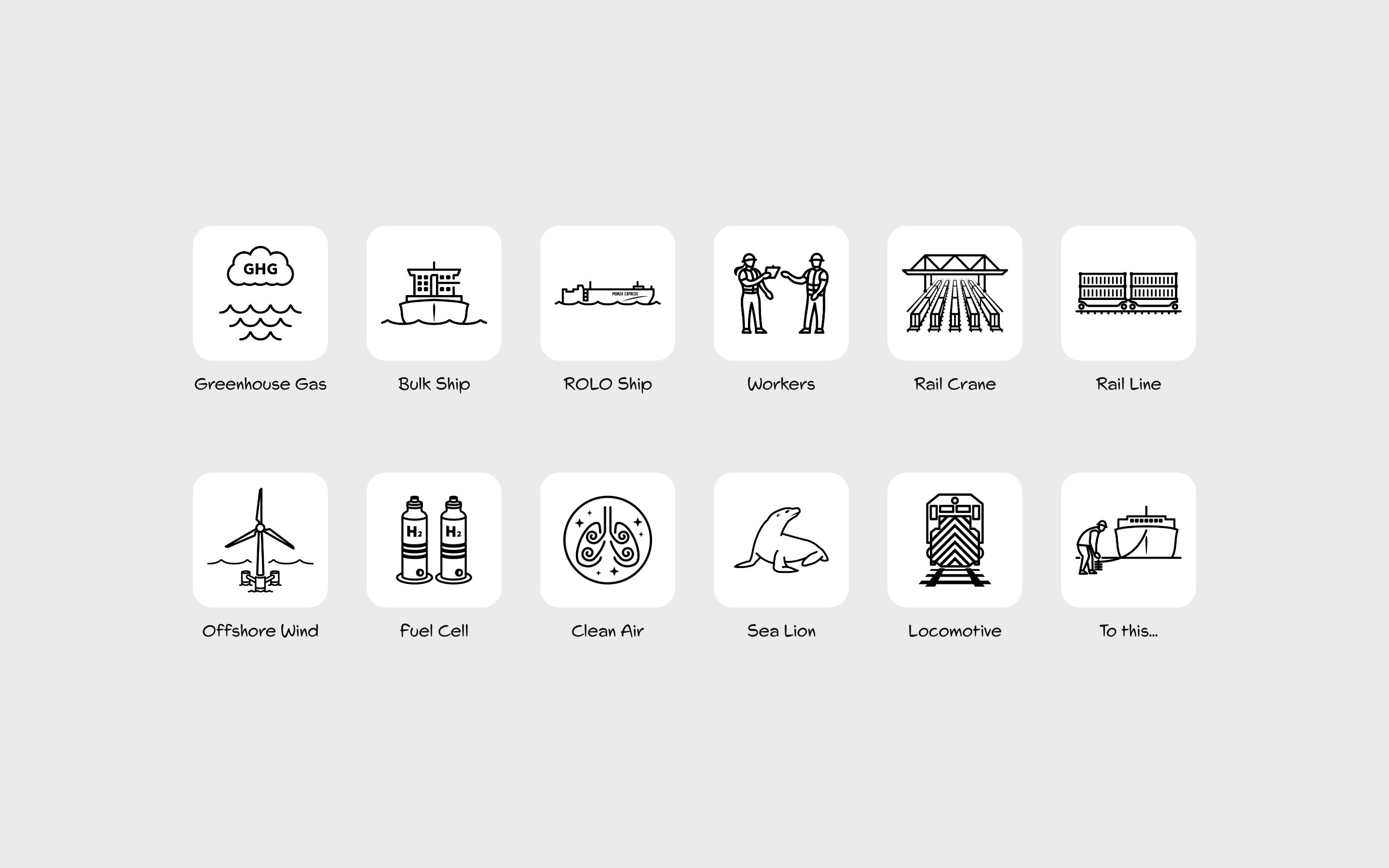
A custom icon library built to replace an outdated, inconsistent set of stock pictograms in POLB's presentation materials — covering everything from greenhouse gas categories to offshore wind infrastructure, illustrated solo in Adobe Illustrator.
ROLE
Illustration & Visual Design (solo)
CLIENT
Port of Long Beach
TEAM
Stellar Agency
BACKGROUND
A small ask that pointed at a bigger gap.
The brief was specific and modest: POLB needed an update to their presentation deck's pictogram library. But POLB's subject matter doesn't map onto stock icon sets — greenhouse gas categories, specific emissions types, clean-energy infrastructure, specialized port equipment. What existed had been assembled piecemeal: inconsistent line weights, mismatched styles, icons pulled from different sources that never quite matched.
A deck refresh wasn't really possible without solving that underlying inconsistency first. So the small ask became the occasion to build a real system, designed for POLB's print and digital communications broadly rather than one deck alone.
THE CHALLENGE
The subject matter is the hard part.
Most icon work is about feeling — friendly, modern, on-brand. This was about correctness. POLB's materials need to visually distinguish things that are genuinely easy to confuse: a hydrogen truck from a CNG truck from an electric one, an AGV from a yard tractor from a rolling crane, sulfur oxides from nitrogen oxides from greenhouse gases — each with real chemical notation that has to read correctly to an audience including regulators and technical stakeholders. Blurring those distinctions isn't a stylistic risk. It's a communication-accuracy risk.
The other challenge was volume. Producing 60-plus custom icons across genuinely different subject categories, without a consistent system to move fast within, meant either working painfully slowly or ending up with a library that felt stitched together.
THE WORK
A system with rules, then sixty-plus icons built on it.
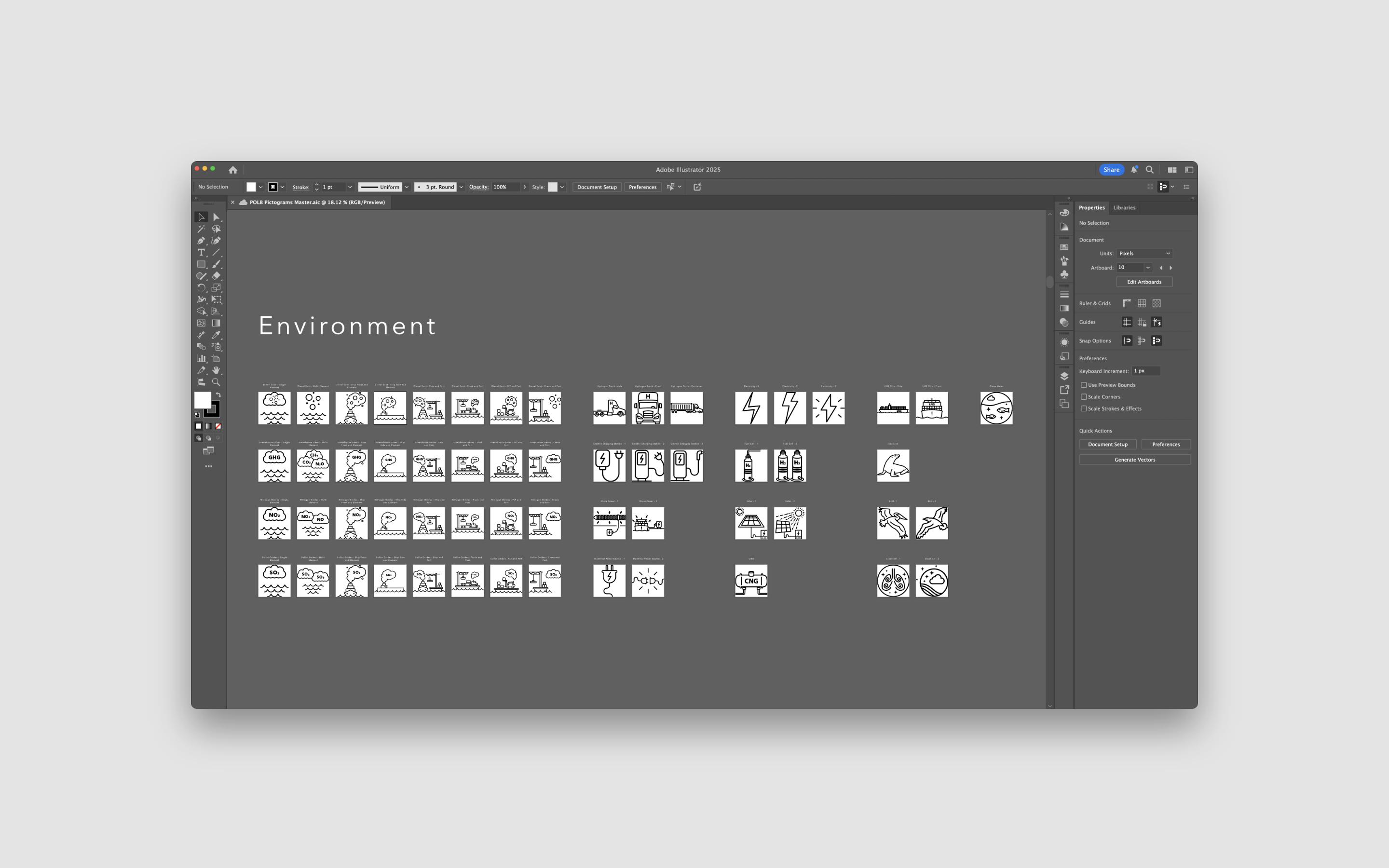
I hand-illustrated every pictogram myself in Adobe Illustrator, organized into four categories: Community (worker, health, and education icons), Environment (each emissions category correctly labeled and visually distinct, alongside clean-energy icons for EV charging, hydrogen, solar, and shore power), Pier Wind (funding, community engagement, and electrical-grid icons for POLB's offshore wind initiative), and Trades (the actual equipment and vehicles of port operations — ships, cranes, rail, trucks, terminal vehicles, workers).
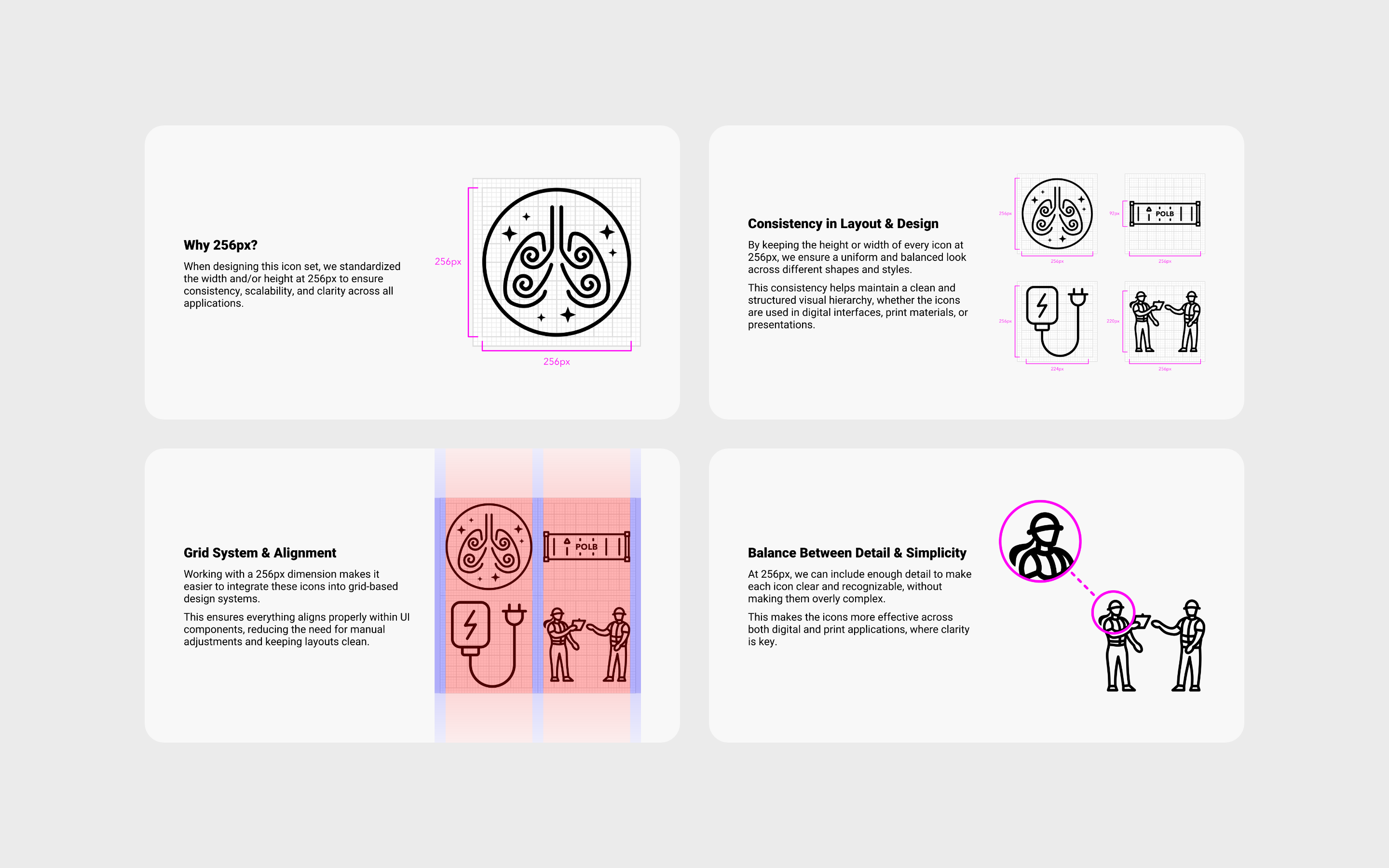
Before drawing at volume, I set a fixed sizing system: every icon built to a 256px base, scaling cleanly down to 128px and 64px while staying legible, with a documented rule against pushing detailed icons to 32px or 16px where they'd lose clarity. That single constraint did most of the work of keeping sixty-plus icons, built across weeks, feeling like one coherent set.
I delivered the library with a short written guide explaining the sizing rationale — why 256px, how it scales, the grid alignment logic — so other designers using the set later would understand the system rather than inheriting a folder of files.
OUTCOME
A real system now available for whatever comes next.
The library shipped as a complete, documented pictogram set — sixty-plus icons plus source files, available for POLB's print and digital materials going forward. The immediate ask was solved, but the more durable outcome is the system itself: a consistent, extensible icon language POLB now has on hand rather than another one-off stock-icon patch.
REFLECTION
Illustration and systems thinking aren't different jobs here.
What this project asked of me wasn't just drawing ability — it was research discipline. Getting a hydrogen truck visually distinct from a CNG truck, or correctly notating three different emissions categories, meant understanding the subject matter well enough to make the right distinctions, not just making something that looked nice. That's a different kind of icon work than most brand libraries require.
The other thing I'd point to is the value of a boring constraint. The 256px rule wasn't creatively interesting on its own, but it's the reason sixty-plus icons, illustrated solo, over time, still read as one system instead of a drift of individually-invented styles. Good systems work is often more about the rule you set at the start than any single piece you make under it.